Salamandra 1136 Share Posted November 27, 2011 Link to post Share on other sites More sharing options...
Briamoth 41 Share Posted November 28, 2011 Here's a better one, I think. Link to post Share on other sites More sharing options...
Salamandra 1136 Share Posted November 28, 2011 Forum one looks decided >_> and my pictures are too cluttered. Here is a VERY simple picture I just took, and has that same Light/Dark feel. Link to post Share on other sites More sharing options...
char615 41 Share Posted November 28, 2011 If anyone could provide the original forum background I would be grateful. Link to post Share on other sites More sharing options...
Salamandra 1136 Share Posted November 28, 2011 lol alras instead of oren (although alras does look better imo) Link to post Share on other sites More sharing options...
Briamoth 41 Share Posted November 28, 2011 Here is a high-res version for you. I have a larger one on hand. http://oi41.tinypic.com/snyn14.jpg Link to post Share on other sites More sharing options...
Elindor 666 Share Posted November 29, 2011 I'm liking the new website, its cool looking and stuff, but I want my wiki back. Link to post Share on other sites More sharing options...
No_Mortale 54 Share Posted November 29, 2011 Is there a particular skin package that is required for screenshots? I don't want to make one with a skin pack that is disliked.. Link to post Share on other sites More sharing options...
No_Mortale 54 Share Posted November 29, 2011 Is there a particular skin package that is required for screenshots? I don't want to make one with a skin pack that is disliked.. Link to post Share on other sites More sharing options...
Salamandra 1136 Share Posted November 29, 2011 When I go to the website, it's just a big white screen with text on the side that say: The Forums The Wiki Donation Center ...and then it goes through everything else, with no fancy font or any color, no background. Just blank. For Example: Link to post Share on other sites More sharing options...
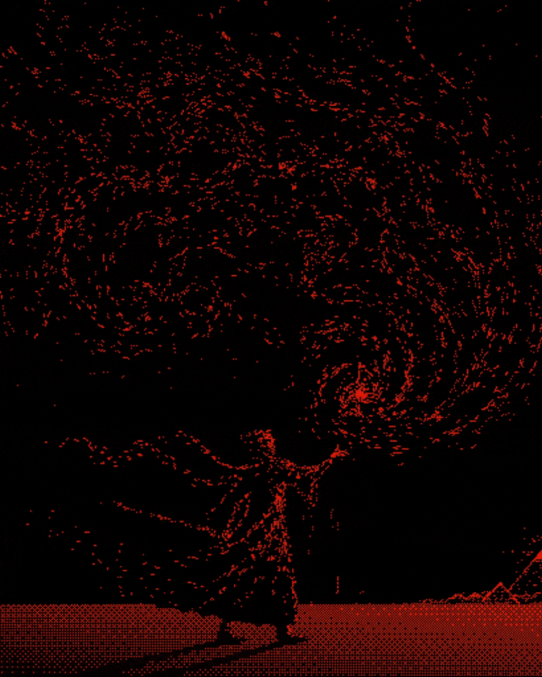
Sporadic 2844 Share Posted November 29, 2011 My first attempt: Laurelin, Home of the Favored. For display purposes. If using this as a website background I'd recommend better image compression, an extra blur filter, and some split to work around the foreground template. Note that this is a quick render. improvement on quality can be made if so desired. I'd appreciate feedback, seeing as I can provide a lot more than this image if only people give me specifics. EDIT: possible preview: 2 Link to post Share on other sites More sharing options...
Salamandra 1136 Share Posted November 29, 2011 ^ That's incredible. :D Link to post Share on other sites More sharing options...
Sporadic 2844 Share Posted November 30, 2011 ^ That's incredible. :D Link to post Share on other sites More sharing options...
char615 41 Share Posted November 30, 2011 I had another Go, 5 Hours of Hitting the Computer with a Hammer in frustration later, my comupter Crashes and dies, I forgot to Save... So instead I made a Watercolour of The Alkhazar Keep! I am Actually Pretty Proud Of that, God... I feel like Van Gogh... Link to post Share on other sites More sharing options...


.thumb.gif.5ceba2d01f50d0d25c87532ab910c11a.gif)


.thumb.png.4e5370fc69f142d96a905e477cd5dd97.png)


Recommended Posts